Case Study: How to make a transaction list view more loveable
Mobile Banking App Screen Redesign

Introduction
Whether we use internet banking on a desktop, notebook or use a mobile banking app, we come across a view that lists all of our transactions for a given account in a chronological, descending, endless list.
You could say this is a basic setting or feature of a banking application. You would think that the user-friendly design of this screen is the easiest task. But not. I present this with a possible redesign.
The screen is in Hungarian, but this should not discourage you from reading, I attach an English explanation to every item. It will be clear.
Methodology: I approach the problem from the perspective of a completely average user. In addition to myself, I interviewed two other users in this mini-project. Both have different professional backgrounds, neither of whom is financial, banking professional or economist. They know some of the financial law lingoes because ‘they were enforced to learn it by the banks’, but otherwise are not fertilized. Tools: Figma, Placeit.net, and WebAIM for contrast checking, short interviews and testing with my sample of users.
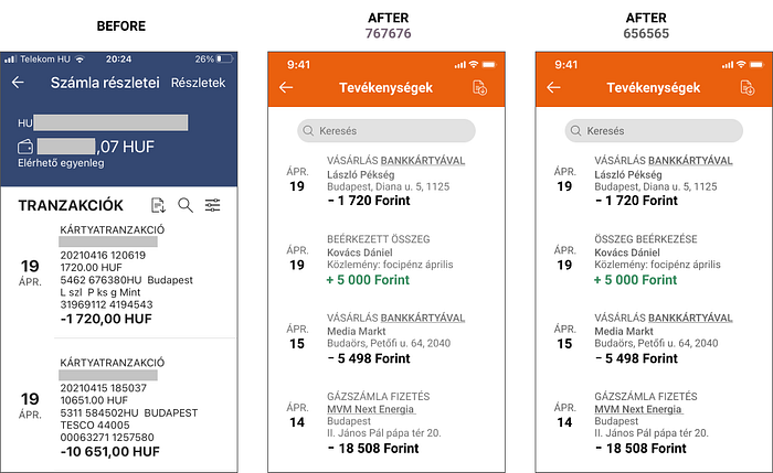
Example: a typical transaction view of a mobile banking app
My concrete example is an existing mobile banking app that I use.

These are the current store ratings of the app, reflecting several releases, obviously, thus somewhat could be misleading when there is an improving path in service quality for instance. This specific bank is focusing on iOS with the implicit assumption to tap the affluent clientele. Their iOS app won the mobile app of the year in this country a couple of years ago. I am investigating this version on an iPhone SE.
Though, as I said, not the specific bank is the point here, since this kind of transaction view is quite a general screen at every bank. It is just easier to show it on the concrete example.

The user sees this screen to the left. This is quite typical in Hungary. I assume three basic reasons for this without specifically researching it right now.
Most of the banks here are members of an international banking group. If the applications were developed at the centre and ‘only installed’ on local markets, this could be a source of problems.
Banks copy each other’s solutions without any particular critical analysis, possibly in part due to the suppliers’ influence.
Legacy systems are very strong.
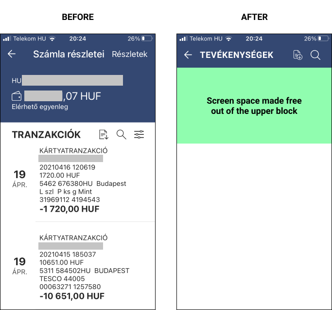
On this screen, we see two main blocks. Blue occupying the top one-third and white two-thirds occupying the bottom. Let’s look at these in more detail.
The user receives 20 different information on 4' inch
On this screen, 20 different information (visual or text) is attached to upper and lower thirds in case of 1 transaction out of which 10 is repeated for each transaction.

Before making any redesign suggestion let me summarize why, for what purpose the clients use the transaction view or better call transaction list view.
Why and how the clients use the transactional list view?
- All 3 users in my small sample accomplish quick checking with the help of this screen scrolling down in the recent month(s), meaning, whether an expected sum received or did I transferred the X amount to Y.
- Some use it for budget controlling (‘for what and how much money spent’) while the other uses a specific app from a third party for this purpose despite being a client of two major banks. (This signs there is still an opportunity here for the banks.)
- This small sample hardly uses Search or Filter features at all. The reason for this if you can scroll or with one tap see more results and the layout is clear, then you most likely won’t do any more extra settings which doubles, triples, quadruples etc. the number of interaction. The other element at least as important is that if you had previous experience with Search and Filter that did not work properly (which is not an unprecedented case) you never use it again.
Given this context what does the user understand from this screen?
The user’s understanding
I detailed the 20 information with explanatory comments. On top of the box is the translation of the item, the comments of the users are in the yellow boxes. The conclusion and the proposal for redesign are below the following exhibit.
Let’s see the upper block of the screen first:

Conclusion and proposal for the redesign: the users do not need the account balance information here. It was already on the opening/home screen of the app. It is only needed if the client wants to initiate a transaction, after checking items, whether the amount is covered by the balance available on the account. But to initiate a transaction the client enters that menu. The balance is relevant there.
What makes sense here is to keep the name of the screen, the Download (of the transaction(s) in detail as an official banking statement), and a Search. If the Search works properly and results can be filtered further separate Filter is likely not needed. (In this specific case Filter, though with less useful categorization worked properly, while Search did not work at all.)
The main objective of the user here is to find a specific client or possibly, amount. This explains the reason for a Search.
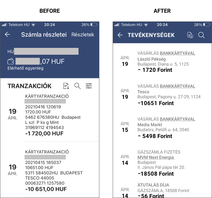
Then let’s check out one transaction in more detail:

Conclusion and proposal for the redesign: cut everything which is not known by the user or it is not the user’s task to know it. Emphasize the client’s name more visually. Change jargon to ordinary language.
Language
In my view, in a UI, especially when a client has contracted already with the bank nothing justifies the jargon if there are ordinary words. Those sound much familiar and enhance the client experience. As a sample, I used this vocabulary (in Hungarian):
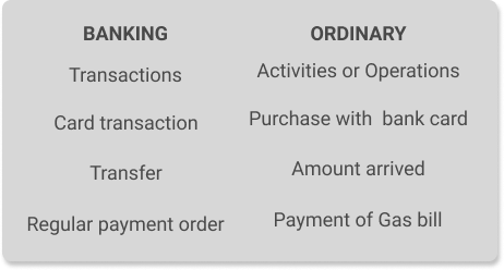
The banking jargon does not express the direction of the transaction whether it is a charge or a debit. The right column does. Scrolling, it is much easier to find an item if the type of the transaction speaks for itself.
The 4-Step redesign
The task is now easy. Since we already know that the users want to check items quickly by scrolling we should keep everything that is relevant and cut all, which is not.
Step#1
What we need from the upper block here are ACTIVITIES, Download and Search. If Search is well designed, trustworthy and stable from an operation point of view, that is likely enough and a separate filter can be left out with features integrated into Search.
Step#2
Let s have a look at the lower block, the specific transactions. What happens in real life as I said the user wants to check items and initiate action if something inappropriate was found. The client wants to do this simply and quickly.
The user need is very little basic information to immediately identify any action made on the account. Which means the date, type of the action, amount with currency, client name, and a simple client identifier that is recognisable by the user. All additional information is just an unnecessary cognitive load for the client. The client has nothing to do at all with how that bank’s systems and databases built internally, what identifiers it uses for the specific banking transaction. From the client's point of view, the bank should be able to identify anything based on these data.
I set the less accentuated fonts to 7C7C7C. (It is more grey in the original too than it looks on this screenshot.). Although not visible here, in the original there was a grey horizontal separator line used among transactions. If we reduce content to the most essential for the client, it does not seem necessary.
Step#3
Since Search is just a field, thus, consumes limited space I would make it a constant element. It implies that it must be working properly. Only the download of the detailed transaction would remain in the header top right.
This specific bank uses dark orange, black and grey on its website, so I changed the colour from blue whose shades are the colours of another bank.
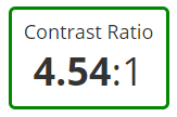
For the title, I switched from uppercase to title case which seems less accentuated visually. I set the less accentuated font colour from 7C7C7C to 767676. This way we still have an acceptable contrast ratio.

In the end, I double-checked the result with my testers. They liked it, but I received an interesting comment though, it may seem funny. Namely, I should incorporate at least one + item because minuses ‘make the design so sad’. I never would have thought of that.
Step#4
Is it allowed for a designer to cheat this way? If I have already modified it, I have amplified the contrast based on the view of my other tester. The new is still softer than the original. And I changed the wording for one item to remain consistent and reflect action instead of status.
So the final contrast ratio improved a bit.
Takeaway?
Just to mention a few.
- ‘Typical clients’ use even the simplest screen surprisingly often and a to a lesser extent use sophisticated features that bankers or IT guys created in one of their electrifying moment.
- When you redesign one screen only that seems simple, it still needs to be in context and the details need to be thought through. If a feature is not reliable, it is preferable to hide it in the app, since it only leads to unnecessary frustration and loss of trust.
- The UI has to start from the customer, show the minimum understandable client relevant information. It is not the client who should tackle with long series of figures and letters never seen before coming from internal legacy systems to identify a specific transaction with an employee in the bank’s call centre. Reducing the information load from 20 to 8 made the screen more loveable.
- Last but not least, it sounds more friendly to speak the client’s language, not the financial law lingo. Bingo?
Would you like to bank?
Thanks for reading this article.


