Case Study: Browser icon from your tie
Short and silly case study for UX rookies
Introduction: humour is needed
As a novice in UX or digital product design, you need to build your portfolio from scratch quickly. This is the #1 task everyone tells you since labour market experience shows.
For a moment let’s forget those junior designers who have learned this at creative majors of the relevant universities, thus, arrived into the industry with a ready-made portfolio vast and polished. Don't misunderstand me when I am saying it is ‘easy’ for them to enter the job market.

Now focus on all the others, such as e.g. career switchers at any stage of their professional or private life. This segment is less obvious, thus, much more interesting for me. For this latter, quick portfolio building is in a sense stressful. Humour — as in life in general— is essential not to burn out at the very beginning even before landing a job.
Start to design your presence on the web
In the design industry, you find that everyone has their own website. So you need it too. You try some tools, get tips from others, and create yours. Then, like me, you start to iterate, because in the meantime you get inspired and realize that what you’ve done so far is either bad, or there’s nothing distinctive about it, it doesn’t taste or stink (and partly because that’s exactly why it’s bad).
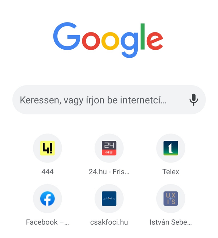
Let’s take an example and start with the basics. Your website builder tool has a well recognizable default browser icon. How embarrassing that you want to become a UX designer and you haven’t even changed this icon yet indicating your distinctive-to-be designer website?
What is your personal icon?
Take a few minutes to relax between two projects and replace it. What do you need for this? Some kind of own logo. Basically colours and letters that refer to you. The latter, of course, can be anything else, figurative, not just text.
For colours, you turn to the free factory preset colour schemes, the different colour wheels and mix something you like.
But I wanted to be even faster and in a sense more novel.
In fact, this work is already done! After all, the colours were already mixed out for me by professionals long before I wanted to be a UX designer! What?
It occurred to me that I have some ties that I really like, of harmonious colours, elegant. I took out two, exposed those to natural light, took a photo with a mobile phone (which cheats colours obviously), imported it into Figma, so:

I then sampled these and created my potential pool of colour scheme:

I didn’t want to bother elaborating on a figurative logo. On one hand, it would take a long time and I see the point if, for example, I own a company with that name, or I build myself under that name on various professional or design-related social media on the other.
This is common practice anyway, especially for y generation and younger. A young tech guy appears as a DJSomething on Clubhouse, while I ran into a fox avatar as a speaker in a Zoom roundtable on a high prestige global design event last year. I am not joking. In design, everything is possible and can happen.
I have the colour pool, fine. The text part reminded me that ‘UX’ has to be in it somehow. Respectively, my initials came to mind. Not very imaginative, right? Although this way the solution came right away because if I put in the UX and it has also an I in it then it can be horizontally UX, vertically UI and that’s what I want to do. Plus, by chance, the XS also makes sense, a bit of a hint that most designs are likely to be mobile. Unfortunately, the relevant company does not pay for it for me.
I constructed the icon on an artboard of 40 * 40 pixels. So all I had to do was point out somehow that the letters could be read in both directions. After selecting the background colours, I generated a few versions and selected one. Of course, you can generate much more. I also played a bit with the colours of the cross.
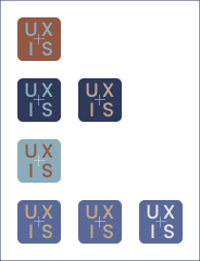
The end result? It could be more contrasting which is vital in UX design or the fonts may be thicker. But in the end, it is visible, elegant and last but not least absolutely self-identical. And not the default setting!
The takeaway from all of this?
Using your ties is silly, as the world nowadays. I haven’t written so short yet on Medium, thus, it is personal progress. The life of a novice UX designer is stressful because of the compulsion of portfolio building, having no idea how to get the first job, and whether it fits. Thus, always try to smuggle humour into your work. Avoid people (and companies) who can’t laugh at themselves. Feel free to experiment with unusual ideas, especially if you don’t have a big bet. All these take your tension off a little bit between two projects.
Thanks for reading this article. If you like it read other stories of mine as well.
Visit www.istvansebestyen.com for more.

