Case study: How UX design supports ‘new’ tourism?#3
I hope that this four-part article can provide beginners in UX design with some useful insights, and tips. In this special case study, I present my first mobile app design on my own; ‘Budapest Murals’ is an extended MVP for tourism. The main focus of the project was to practice prototyping with the software I had not used before. The polished UI was not among my targets. The operation framework that I set to myself as a limitation for the whole project including the full documentation (= YouTube video, Highlights on Behance, Case Study on Medium) was one month. I made all these for the first time, only the case study was an exception in a sense.

I present the mistakes I made through the evolution of all functional building blocks of the prototype.
On the screens, I numbered which wireframe/prototype iteration they belonged to. In the last, the fourth full iteration you will see that I iterated some screens more than once. But that is my only cheat. Of course, I still think the end result is ‘far from ideal’ to be polite.
Beyond the remarks below the screens, the content is structured simple: Concept, Feedbacks, Tips at each block. Concept: my preliminary idea; Users Feedback: results of test rounds; My Tips: takeaway that can be interesting for beginners. I indicated with a green tick the screens included in the final proto.
There were three test rounds, with UX vein testers, with my former teammates on xLabs UX design training.
Now let’s see the blocks of the proto as follows:
INTRO — ‘FILM’

I wanted a sweetener before the common onboarding, not just jump into the app. Something that puts the users ‘in the mood.’ I created a kind of slideshow which I call ‘film’. Wherever possible, I selected that mural which is reflecting one relevant feature of the app.


Its reception was mixed. I should have shortened, halved ‘the film’ in time. I was even given the idea to use the full screen for the ‘film’. I should have made it skippable (it was not in the 3rd version, I wanted it compulsory for the users since I thought it is short enough).

The seamless user experience firmly says that a user wants to use the app as quickly as possible, thus it does not make sense to design any additional load. ‘The film’ was not planned at the beginning of prototyping, but by the end of the design process. It was on result of my ‘falling in love with my project’ which is a mistake to be avoided. Last, but not least, most of the things in a design, which is not compulsory, should be skippable. Text and its grey background moved differently, thus, I created components of those. Maybe not too elegant, but then it worked. I can only suggest to make a lot of components, it facilitates quick iteration.
INTRO — KEY FEATURES

A simple visual summary of services the app provides. Clicking on the icon, you would get a more detailed explanation where relevant. The CTA is skip.


Drastically shorten the initially sketched 5 screen presentation of the features. Icons should be of the same size, either outlined or solid. Better in the same colour, but without fill, the background should be the colour of the screen itself. Don’t scroll, if possible.

All of my screens of listings of features or selection among various features became a nightmare, a crap. I’ve looked at several solutions then and since, but I don’t have a ‘wow’ experience yet. My final compromise is too varied with colours, too loud. It developed during the above painful iteration, but still very far from acceptable. Another interesting thing is how its place changed in the prototype. First, it followed the settings, the language selection and the access to location and camera, then I brought forward after the intro ‘film’.
REGISTRATION

Initially, I imagined 3 versions of the business model: users can be unregistered; or registered; or in a paid plan. Then I abandoned this latter since users would pay for the specific added value services like making souvenirs. I intended to compare the unregistered use of the app with the registered one transparently. With showing the full range of services, I encourage the user ‘smoothly’ to register into the app.


Make the wording clear on the registration screen: features are free. All features gives you information, but it is not the main CTA on this screen, that is register. Testers liked the final version of the 9 Benefits of Registration.

I asked for the first name only to register to ask for as little info as I can. Full details are only needed when ordering a souvenir, or not even there depending on the payment method. Probably, screen 9 Benefits of Registration is the closest to current UI trends. I decided not to compare side by side the two versions, just to show the full, and at the end to summarize in one rectangle the unregistered features. This screen looks acceptable vis-a-vis my other selection screens.
SETTINGS

I used onboarding industry standards such as language selection, geolocation, and access to the camera. In addition, I just wanted to give this part a unique flavour that fit the overall visual concept of the app.


The paint stain was not the most recognisable for selecting languages, but when realized, the liked it. I originally forget to ask for access to the camera, even though the photo module would be launched from the app by the user. This turned out during the test.

Onboarding progress is marked, red refers in a sense to the brick of the wall. Probably in the majority of cases onboarding settings do not have the character on their own, just want to be seamless, quick. Do they need to be unique?
HOME — TOUR ORGANIZER

A 5-way tour organizer includes planning the mural tour by selecting from the map, or from the app’s gallery of all mural photos; or by the time available; or by murals liked the most by others; or by searching for keywords. I wanted to make it astonishing, visually. How did I fail?


If the choice is limited to one screen, do not use dropdown, since it is just one more unnecessary interaction for the user. If you use ready-made icons from icon stock sources, but likely from various creators, set those to a uniform size, preferably out of one or a few colours with no background. Solid seems better than outlined.

I did not want to repeat the same solution that I used on the earlier screen of 9 benefits of registration. Then came the idea of making selection look like the parts of brick or wall. Its an ugly, aggressive solution, but I was working under time pressure. There is no next button, since selecting the option is the CTA, the interaction is automatic. Where relevant in the lower tap bar, always sign where the user is in the app. I used iOS blue for the icon, plus opacity and layer.
MAP -BASED SELECTION#1

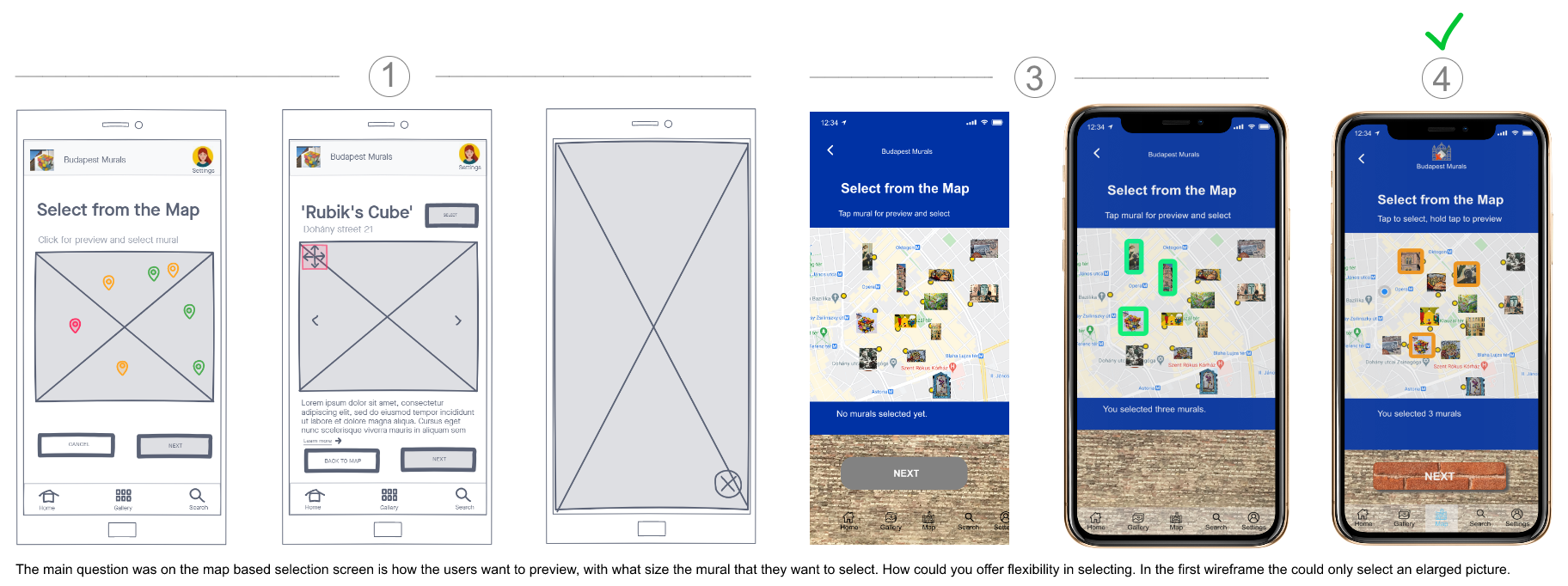
This feature could be useful if the tourist can use maps well in general, wants to visit other things between two murals and can select quickly. Murals appear as miniatures on the map. Users can tap to select. I tried to follow the convention related to maps.


Independently from their original size, murals should be the same size on the map to reduce visual load. Users should be able to select murals quickly tapping their miniatures as well as their preview. A preview is needed.

The only tricky point here is how large the map and the magnification should be as default to select directly based on the miniature view. Why it is not full-screen size here? An A/B test could probably give the answer.
MAP -BASED SELECTION#2

Users can enlarge the mural miniatures to get previews and select those to compile their tour.


The full-screen size option is not necessarily needed.

First I made murals selectable on two sizes, then I reduced it to one, then I made it to three. Tap once selects the miniature, hold tap enlarges the icons to preview and select. I also kept the full-screen view due to the different original size of the murals. Here, the next is needed, since the app does not know in advance how many murals will be selected. As far as the enlarge, close, select I used convention or iOS design elements. It can be a question though, that in the full-screen view are we on the map or in the gallery menu?
Thank you for reading this article. To continue check out Part#4. You can find the video of the clickable prototype here, and the highlights of the project here.
If you like this article, follow me and read other stories.
