The Mystery of Chemistry: Test Exercise for a Junior UX Designer Job — Case Study

If you don’t want to suffer through the job application intro with some takeaways, you can jump directly to the test exercise.
‘I can do that too..’
Social media is full of success stories day-to-day: promotions, new jobs, exams passed, sold x amount, visited all countries, ran, climbed, jumped, liked, viewed by hundreds of millions. Fanfares when a 100,000 staff company comes up with something usable. Success whatever it is is a kind of measurement in these times, especially. But normally, you know why you were successful in something. More interesting to know why you failed and what comes after.
This story is about a UX novice’s funny wing trials and failure with the chemistry. After 22 years in the banking sector, I decided to test myself in UX design. In, beyond and outside banking I experienced so many unusable products in my life that I said to myself once ‘I can do that too..’.
There are local UX design companies with significant exposure to the financial sector in terms of clients and projects. It seemed rational for me to think that my experience could be valuable for these companies.
‘Even though you seem likable based on your CV…’
Thus, like a bungee jumping, I sent my banking heavy resume to one of those firms a year ago before having anything in UX design by definition like education, portfolio, and connections within the industry. However, I had practical experience with some of the double diamond building blocks: research, concept, ideation, testing, UX writing just to name a few. In the job advertisement, it was stated that you can learn the necessary skills in the company with the help of a mentor. It sounded amazing. Their answer was, ‘even though you seem likable based on your CV, unfortunately, we have now decided to move on with other candidates.’ I was wondering but then forgot the whole thing.
Stepped on the difficult road of UX

Not remembering this case at all, a year later, with two UX courses attended at xLabs, with one comprehensive UX design project done, with initial portfolio elements, I applied again and submitted a completely different UX-heavy CV. The job ad says you don’t need the technical knowledge of wireframing with eye-catching UI because you will be taught and mentored for months. What is interesting is your thinking. I found this heart-warming. I honestly told in the HR interview what skill I still need to improve. But that was OK; it wasn’t interesting for this position. Following the interview, I was given a three-day test exercise.
The 3 days test exercise framework
The framework was as follows: you can, but ask as little as possible about the exercise. The deliverables: you are required to accomplish a presentation, to elaborate on wireframes, and write down the explanation for wireframes. All these should be delivered in pdf format.
Don’t panic. I’ve hated every exam since I was a kid, I’ve never had a good time on the tests, even though I put a lot of effort generally and sometimes the result was good. Simply, I was not trained to do tests. (In addition, I think that CVs and tests are not really differentiating in the sense that the internet is full of samples and hints on how to master and accomplish perfect ones to deceive the HR filter). Now, because I am motivated to become a UX Designer, I was terribly excited, like 35 years ago or so in school. I read through the task twice which presented the results of a two-day workshop with the client. It seemed to me that I basically understood the context, the problem, and the task. As my panic subsided, I could start thinking about how I will accomplish all this within three days.

‘How might I?’ Four pillars of my working method
Four things came to my mind that determined the course of the next three days. I can link all back to my UX studies, those are logically related to what I learned there.
- Follow the MVP approach. I immediately decided to create a wireframe that I can do with a rational effort for having an MVP. I will do this in the software in which I have had the most experience so far and the best impressions. I don’t stretch myself to make all wireframes for a full application or to make a Hi-Fi prototype or wireframes. No matter how much I felt like others were doing it or because I was tempted. For all of this above, I chose Miro for the wireframe and not Figma, although I know that today the industry-standard or trend is increasingly Figma. I would have spent a disproportionate amount of time with Figma for little return. I will be more eye-catching later having more experience in UX.
- Show that you understand the design process end-to-end. At the same time, I strive to go through as many key elements of a complete UX design process as possible, even if the process is condensed. The elements form a consequent flow and are connected to each other, logically. Everything should be explained since, in UX design, there is no self-evidence. I was convinced that although my solution may not be good or especially nice enough but should be put together well structurally. Based on my studies in UX, I considered this to be much more important than the UI heavy proto. Otherwise, why would a candidate get half-year mentoring? And at this company, UI is separated, anyway.
- Demonstrate to work independently. Although in principle, it was possible to ask back, I decided in advance without knowing the task that I would not. I will interpret the task somehow and explain why I interpreted it that way. Strictly from my job application’s point of view, it is correct because it refers to my capability of working independently. However, from the UX design process approach point of view, it is wrong, because if something is not clear you have to go back and ask, ask, and ask. Go back to the research interview or to the desk research.
- Compile one concise document fitting to the UX company visually. Case dependent, it can be the client, of course. I also figured out that I integrate everything into one product concept material as if I were presenting it on behalf of the company to the client. I had no other visual hint than the format of the task I received. This obviously has nothing to do with a conference presentation; its format fits a summary of the results of a workshop held at the client.
Unexpected difficulties and a strategic decision

At the Desk Research, two things turned out markedly.
- I looked for HR apps to analyze. But it turned out, that I can only review the real knowledge of HR apps as an authorized logged in real business user. I didn’t have the opportunity to do that. Otherwise, almost nothing can be seen. I dismissed the idea of making the survey of my Colleagues in HR, it is summertime, hard to reach anyone. Thus, I should have to rely on my past working experience.
- In the case of the Calendar, and especially of the KPI Dashboards view, I realized that BI or Dataviz applications should be reviewed for best practices. This time I skipped this for two reasons. First, it is a content issue that needs to be agreed with the client. Second, just because there are a lot of apps for something that doesn’t mean they’re good.
When I created the wireframes I immediately knew what is wrong: an unnecessary button, a wrong interaction, inadequate visual layout, etc. I transparently described these in the explanation to the wireframes section. During the course of normal design work, these critical parts undergo in-house iteration and testing with the customers, obviously.
I elaborated on a business concept, accomplished desk research, crystallized the focus in value/best practices matrix, and made a synthesis of the desk research and the requirements of the client. I formulated the design principles, the basic flow, and IA, wireframes, and explanation related.

At this point, I thought that I arrived at a structured, logical product concept with lo-fi wireframes. I absorbed 55 hours already, including some sleep. I should have made a strategic decision. I lamented for a while, should I correct the known mistakes that I described in the explanation section or work more on the wireframes to be nicer or because it was expressively not the requirement, stop here? I stopped here and submitted the documents.
When the sweet turns to sour
Then there were four sour points in this story. Days after submitting the pdf it came to my mind to search for this topic on the web because I talked to a former classmate of mine who wanted to apply too. Surprisingly, there were 2 presentations. It seemed that this highly reputed company had been giving this test exercise for years. I was surprised, I didn’t know it, I didn’t look after it, I didn’t want anything to affect me at work, thus, it had no impact on me. My impressions were on those solutions that they were UI heavy, nicely made, on one hand, incomparably nicer than mine, but too dense for me and I was not sure that they work in real life on the other. I missed the real-life working experience in those solutions.
The other interesting element was that I did not receive any feedback on that my domain knowledge beyond UX would make any contribution or beneficial either to the team or to the company, which was also a surprise for me given the exposure of the company in the financial sector. I thought it will be touched upon early on.
The third one is that although my portfolio is extremely thin in this early stage of my path in UX I received no feedback at all that I’ve done up to now in relevant social media. (Its nil, but 6 UX related posts of mine were viewed by 5,983 on Linkedin in June-July with connections of 1,200. Started from scratch this June, I have 4 stories on Medium, out of which 2 are on UX Collective already with 409 views, 131 reads. I do not know whether it is a good start from a rookie, or not.)

And then came the black soup. I was rejected. They were very thankful for me putting so much effort into the process. It seemed for them that the business understanding is basically good, reflects my experience. However, there is still room to develop my interaction design skills, but of course, they were aware of that. They decided to go with a more experienced candidate in the process because unfortunately the current team and project structure don’t necessarily allow moving on with a junior candidate. For me, it is clear that day-to-day work in UX assumed, I do not need six months to improve my interaction design skills.

I told this story to my former Mentor, that I was embarrassed and frustrated. He replied: ‘What do you want? Did you already progress at this company compared to 2019, not?” That’s true and ‘three is the Hungarian truth’. When I wrote this, the job advertisement is still out, unchanged. To give it a chance in 2021 is yet to be seen.
So, here comes my first test exercise of 55 hours gross with the context above. I hope that the exercise with this long intro about its context could be useful for beginners in UX because of three reasons. One, you will certainly receive a test exercise. Second, due to the lack of feedback in this particular case, I do not have the feeling that to what extent your portfolio or other knowledge is valuable. By definition the portfolio is key. Third, I think there is an inexplicable mystery of chemistry in which I spectacularly failed.
If you like this article, follow me and read other stories.
Test Exercise for a UX Designer Job
Workplace App for ‘the Company’

Product Concept Presentation
Content
- Our approach for the project
- Our product concept
- Mobile Wireframes
- Explanation to wireframes — examples
- Summary
1. Our approach for the project
Strengthen the competitive edge of ‘the Company’ in a new model

Update: where we stand now?
- 2-day product discovery workshop: documented list of required functionalities by ‘the Company’
- We have an understanding of what is the strategy of ‘the Company’ and its expectation towards the product
- The Company’ is an established facility management expert offering complex tailored solutions to serving a large business client base of 19.000 on a competitive market
‘The Company’ wants to have
- few, state-of-the-art, but
- handy, boxed showcase applications
- in the new Freemium model
- with differentiating these apps from the competitors
- to generate business/clients to its core competencies (tailored complex projects), and
- add to its revenue stream
The Company wants an app for employees and a web-based solution for admins, managers including the timekeeping of office staff with settings (holiday, leave, lunchtime, etc.), edit, management dashboard, alerts/reminders, and related actions, free and paid services.
Transparent, agile design project for this strategic shift
- These new ideas require a strategic and a mindset change at ‘the Company’, in addition,
- The Company’ lacks such productization experience
The approach proposed by the UX Design company for the ‘Workplace App’ design project:
- The above context requires a comprehensive, transparent, agile product design process including research, intensive iterations, and testing to ensure that the end product meets the expectation of ‘the Company’ and the user needs of its targeted clients.
- Developed for various industries, the UX design company has a track record in close cooperation with clients lacking such competencies and experience.
The proposed process is as follows:
The design process and the timeline for selected flow/MVP to start with

- There is two groups of users: Admins (Organisation owners, Managers, other) and the Employees
- The design process is proposed to be translated into two development streams
The design process and timeline for selected flow/MVP to start
- We suggest slipping the development of the two major streams in time
- We propose to start with an MVP for the Employee Flow. The main reasons are threefold:
1) we should collect enough data on usage
2) several screens could be identical for the Admins which later reduces development time and costs
3) our hypothesis is that differentiating KPI Dashboards and visualization of Paid plans are likely to need the most effort and iteration with the client, its a content issue, too
- The admin is web-based, the employee was described as a mobile client or mobile app. One reasonable solution could be a web app optimized for smartphones. ‘The UX design company’ will transparently show the pros and cons of technology options in a separate document.
- It is reasonable to assume that a Manager would like to reach KPI dashboards and the difference between free and premium services on its smartphone as well, in addition to desktop.
- We propose ‘the Company’ to find a name, brand for the app during the course of the project
2. Our Product Concept

Key Elements
The Product Concept must ensure that the product has a differentiating value for all stakeholders
Stakeholders: ‘the Company’, clients, regulation authorities
‘The Company’:
- Tangible offering, easy to sell app
- Door opener hook product to customized complex solution
- Large business client base to be served
- Freemium model to generate business and revenue
Clients:
- Exceptional UX
- Automated, interactive with reminders, flexible
- Stable operation
- Valuable features for free, differentiating premium service
- A facility app with very effective performance management features
Regulators:
- Transparent
- Easy to use for statistics and reviewing corporate conduct
Desk Research
Identifying best practices for the key specific functions of ‘the Company’
- There are a lot of apps on the market for Facility or Human Resources Management
- There are a lot of free apps or free plans within apps
- There are some industry-standard solutions for onboarding, inviting, people management, etc.
- What are the key, specific functions for ‘the Company’ in which competitive edge should be gained?
These will be in the focus of the Desk Research:
- timekeeping for staff
- management dashboard
- alerts/reminders and related actions
- free-paid plans visualization
- A selection of apps voted as ‘Best’ by professional users are to be reviewed.

First impressions based on the free plans of some time-keeping apps:

Some sample screens of HR apps. Useful for ideation, but as a whole, I missed the ‘wow’ experience:

It is reasonable to get KPI dashboard ideas from BI/Data Visualization apps below which seems more accessible and perhaps insightful than the Dashboard function of HR apps:

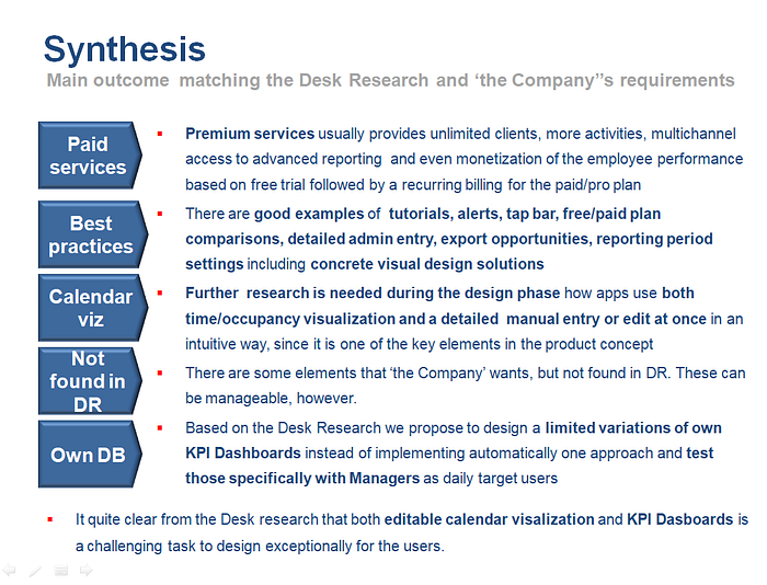
- Based on the above the differentiating value lies in how the following key functions are solved — easily, intuitively and with added value — vis-a-vis the competitors
- To be investigated further with in-depth research
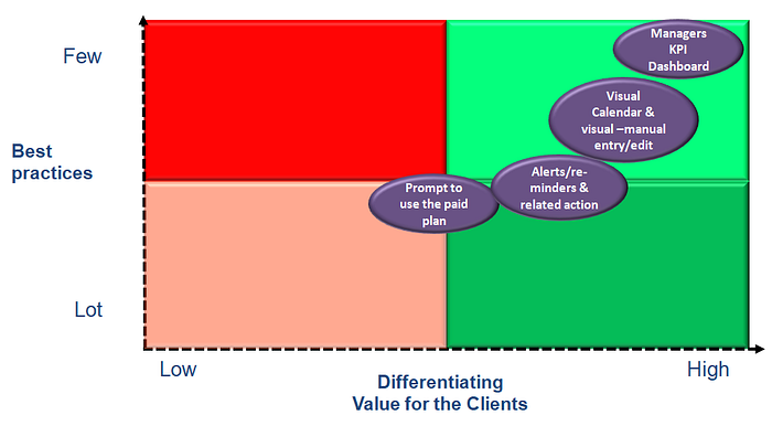
I derived the Design Principles from the Company’s requirements and market best practices:

We propose the set the visual design framework, the baselines at this stage since this ideation work on visual elements can be done parallel with the functional design of the product
Flow and IA for the Admins - A possible Journey of a Manager
Let's imagine the following situation:
- A new unit has been set up in the organization and one Employee moved from one unit to this new one having unlogged hours in the past. The Manager wants to review the situation and solve it.
- Enters the app, create the reporting unit, delete the Colleague from the previous one and add to the new one. Then goes to the KPI dashboard, drill down to the individuals level. Exports the unlogged data and send an invite/alert to discuss it with the Colleague. Following discussion, he goes back to the timesheet and closes it.
- On the next page, the key functions are grouped to illustrate the potential user flows

Flow and IA for the Employees - A possible Journey of an Employee
Let's imagine the following situation:
- Employee checks in, works, then should leave beyond the preset lunch break period to an unplanned meeting outside the office with a client. Due to the reminders, when back, the Employee edits the Daily working hours manually and solves some issues: not logged working hours and extra hours with messaging to the relevant managers.
On the next page, the key functions are grouped to illustrate the potential user flows

3. Mobile wireframes
#1- Employee MVP Flow: Login-Check in-Working — Working Hours adjustments

#2 - Employee MVP screens: Alerts for specific events, General Settings
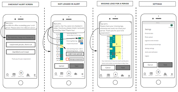
4. Explanation to wireframes

Examples of how dedicated solutions fit the product concept:


5. Summary of the Product Concept
Why the ‘Workplace’ app* is differentiating?
- It provides promptly and easy to understand dashboard screen to Employees
- Transparently presents the working hours and the actions to be done
- Visualized calendar to edit easily
- Provides automated alerts that lead to/require actions
- Provides a check-in/out status icon
- Provides standard and specific settings ensuring flexibility (working hours, holidays)
- Includes a dedicated performance management dashboard and alerts for the Managers ideated on the most known BI/Data visualization solutions
*The Employee functions were shown detailed (wireframe) in this product concept.
Summary of the Process: high-level design process map proposed

- The UX design company proposes to work according to the above process map and the concept presented.
- Identical or similar functions and screens also justify this slipped process.
This is the end of the story of my first test exercise applying for a junior job in UX design.
If you like this article, follow me and read other stories.
Visit www.istvansebestyen.com for more.
